Creating a new application can be time consuming, and the design process is sometimes difficult. Thanks to the automations in UiPath Forms, you can easily, intuitively build new applications.
Say your robot needs a human to input data or choose which branch of a process the robot should use. Basic dialog windows are good if the user must make simple decisions like answering “yes” or “no.” For more complex cases, where the user must input more data, it’s better to use a UiPath Form.
Getting Started with UiPath Forms
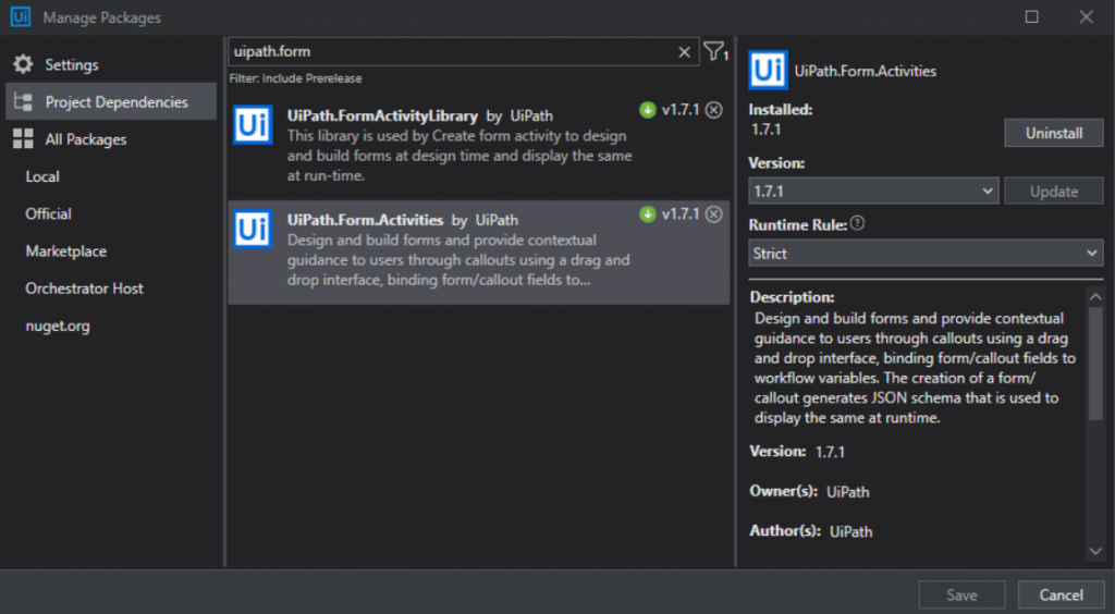
Before we start, ensure you have the most versions of UiPath_FormActivityLibrary and UiPath_Form_Activities installed. Be careful to use only stable releases—no preview versions.
First, I’ll present all the components that you can use in UiPath Forms, and then we’ll build on these basics to build a sample interface. This will give you an overall perspective of the capabilities of UiPath Forms, how to build a personalized interface limited only by your own creativity.
Component Types
UiPath Forms have 4 different types of components:
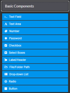
Basic Components
Basic components are the most common and simplest components. Text fields/areas, number and password components are almost the same thing but with different input types. For those components you can set the following:
- A label and its position
- Tooltips
- Some validation conditions about minimum/maximum length of the text or even a RegEx pattern that the text must fulfill before the user can hit the “Submit” button
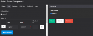
Checkboxes and select boxes are similar but you want to use ‘checkbox’ component only if multiple options are not necessary because ‘select boxes’ component will return a dictionary of string and boolean based on the value of the box and if its checked or not while ‘checkbox’ will return just a boolean value.
In this case, this component will return the dictionary with elements {“option1”:true}.
‘File/Folder Path’, ‘drop-down list’ and ‘radio’ components are returning string values. The only difference between ‘radio’ and ‘select boxes’ components is that you can only select one element of radio options.
The ‘Button’ component is mainly used for submitting the form but it can take other actions like click, event or resetting the whole form.
Advanced components
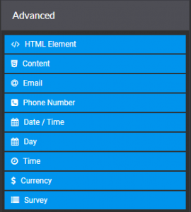
Advanced components are more complex and mainly used for design details or other input fields with special conditions. Starting with the ‘HTML’ component, you can customize however you want by adding code in the ‘Content’ field, therefore creating custom buttons.
- Using ‘Content’ component you can add images, videos, text with bullet points, different styles and links.
- ‘Email‘ component is similar to other text components but it will not allow the user to submit the form until he provides a valid email address. Same thing happens to ‘Phone Number’, ‘Date/Time’ and ‘Currency’ components. It’s also useful to know that you can set whatever format of date/time you want or what currency type you want to use
- ‘Survey’ component is useful when you want the robot to make some decisions based on some questions you asked the user to answer.
Layout Components
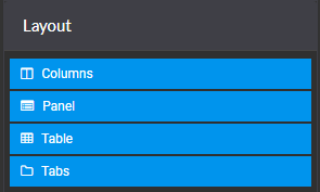
Layout components are used for adding multiple tabs or panels to your interface. You can also use tables to help you position other elements, for example, two buttons side by side because the table cells can contain any other Forms components. Note: These are different from basic data tables.
Use these components to add more tabs or tables for structure and positioning elements wherever you want. If you try to add more elements side by side with drag and drop to the form, you’ll observe that you can only add them above or below other elements.
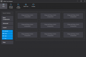
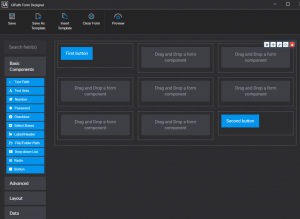
To avoid this problem you can add ‘columns’ or ‘table’ components. Let’s say you want to add two buttons, one in the top left corner and the other one to the bottom right corner. First add a ‘table’ component with 3 rows and columns like this:
Afterwards add 2 buttons to the cells you want:
Data components
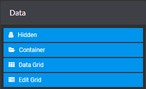
Data components are used if you want the user to add more elements when completing the form and retrieve the information from multiple text fields or checkboxes, for example a row with three fields (name, age, and birth date). The user can add as many rows as needed, depending on how many people there are to register.
How I Built the Sample Interface
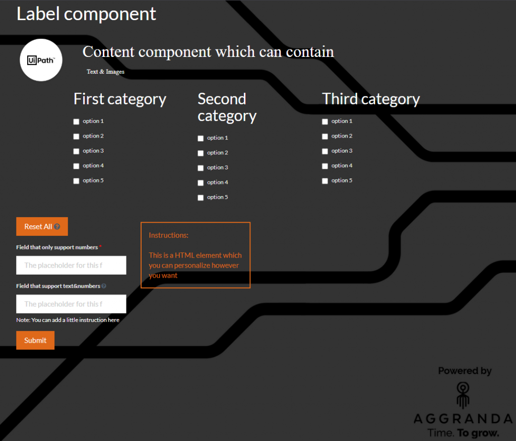
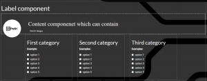
The first part contains a ‘Label’, ‘Content’, and a ‘Column’ component with three columns and one ‘Select Boxes’ component each.
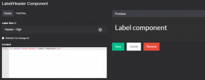
- On the ‘Label’ component, the ‘Content’ field can only contain the text you want to show. You can also add some CSS for a design like this:
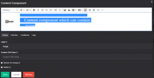
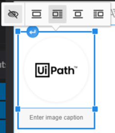
- In the blank field of the ‘Content’ component ,I added an example image by using the ‘Add Image’ button and simply wrote some text next to it.
To move the image, select it and use the options above it.
To add headers to the columns ( ex: ‘First category’ ) I used another ‘label’ component then added a ‘select boxes’ component below:
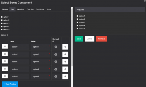
The ‘label’ field is the text that shows up in the form, ‘value’ is what the component is returning when the specific box is selected. You also have the option to add a shortcut key for selecting boxes. A simple trick to create a keyboard shortcut to select all items at once is to set the same key for all of the elements. Be careful to use ‘ctrl + the key which you set’.
For the second part I used the following components:
- 2 ‘Button’ components
- 2 ‘HTML’ components
- 1 ‘Number’ component
- 1 ‘Text’ component
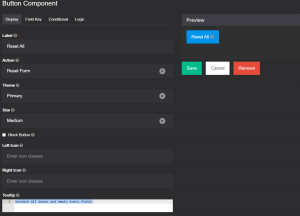
For the ‘Reset All’ button I changed the ‘label’ and ‘action’ fields. Also I added a tooltip to be more specific about what the button does:
On the ‘number’ component I made the same changes and added a validation condition:
With this ‘required’ option checked, a red asterisk will appear to the side of the label and the user cannot submit the form without providing a number in that field.
On the ‘text’ component I used a RegEx validation condition and a custom error message so it can only accept text with two numbers in front, followed by 2 to 16 word characters, followed by another 2 numbers:
The ‘Submit’ button is the default button when you start designing the form.
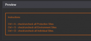
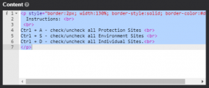
One ‘HTML element’ component is used for the instructions box like this:
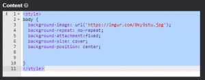
The other one is used to set the background image:
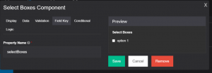
Last but not least, you need to connect the form with your code. You must set some arguments so it can output the data the user provided to the form. For example, if you use a ‘select boxes’ component, you want to do different actions based on what boxes are selected. First you have to name a ‘Field Key’:
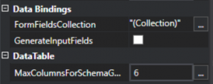
The second step is to set the argument in the ‘FormFieldsCollection’ of ‘Data Bindings’ options:
Be careful to name the argument with the exact ‘Field Key’ you set in the form designer and choose the right variable type. Then, if we checked the ‘option 1’ box the output value should look like this:
Now go and make the application you dream of! 🙂

